The software market is suffocated with new mobile and web apps monthly. That’s why, the focus has moved on ensuring a client-centered, visible, and, as much as possible, unique user experience.
So, to stand out, an app needs a decisive and well-thought UX/UI that ensures a few steps to achieve objectives straightforwardly. Based on our experience in the software field, we compiled a list of best practices you should follow when designing mobile or web apps, to avoid UX/UI mistakes.
#Typography can lead to mistakes
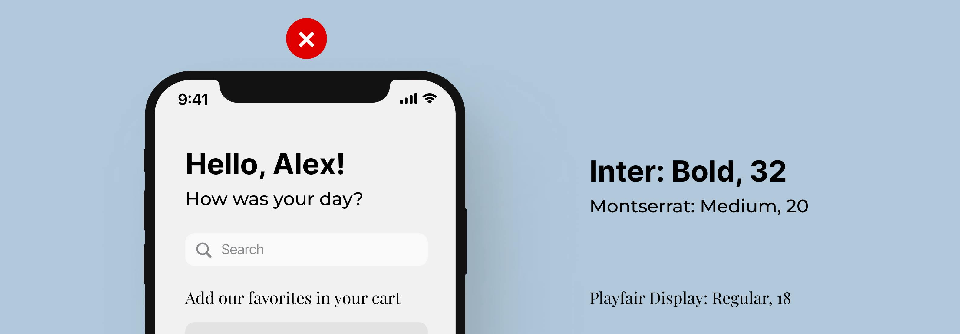
Having too many fonts
Consistency is your best friend to archive a smooth user flow. Aspects such as fonts, text dimension, and headings hierarchy are elementary to enhance your user experience.
Based on popularity in the mobile app industry, we have Sans Serif fonts, such as Open Sans, Montserrat, Roboto, and Helvetica. These are always a safe choice but, if you don’t want to stick to the classics, can lead to messy.
Not having more than two or three fonts is recommended, because they are divided into a font for headings and one for the body.

Use text for accessible navigation
A common UX mistake is not making things obvious.
That’s why labeling icons can be considered in many cases an error. It’s important because an icon can mean various things in other apps. For example, we have the star icon that can define “favorites” in a shopping app or “grades” in an educational project.

Colors and images, common UX mistakes
Always go for contrast
Yes, we know you heard it. Contrast is important. But what does it really mean?
Contrast has never been a fun topic but is crucial in design. If you aren’t careful enough, users may not see or understand elements of your layout (like buttons, text, or sections). Also, color-blind individuals can’t explore your app properly if the shades aren’t right.
How to keep up with rules and accessibility? We have recommended some tools in our article.

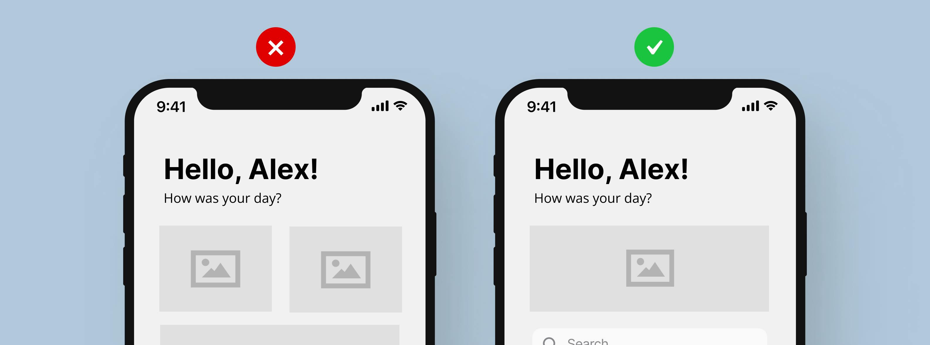
Images can make your app heavier
An eye-catching solution for mobile or web apps is adding images or illustrations. Even though this can lead to a pleasing layout and can guide the users’ attention, it can effortlessly be too much.
Heavy images can make your app slower. Besides the technical aspect, filling your app with images or inserting multiple animations can be confusing.

Novelty or habit?
People are creatures of habit, and when it comes to apps for daily use, keeping things in a standard way it’s valuable.
When we think about the general layout of an app, we think about a footer found at the base of your page. The footer usually includes the home button, search, profile, and some type of wishlists or favorites. This characteristic is seen in almost every mobile app, changing its position can create confusion.
Bonus Tip
To discover our bonus tip, you can read the full article on our website.
Wrapping up
In conclusion, some UX/UI mistakes are inevitable but maintaining your app centered around your user is always a good idea. Complex features with accessible design are the right fit, being provided by Redbee Software from idea to release.
